Have you ever actually really looked at the Starbucks logo? If I asked you to describe it to me, without looking it up, would you be able to? Would you be accurate? Likely not, and that’s alright! I still don’t know my dad’s birthday, so we all have faults in our memory. But that’s besides the point. Today I’m going to take you on a journey through time. We start in 1971: the year that the Pentagon Papers were published. F*ck, I mean, uh, the year Starbucks opened!
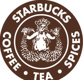
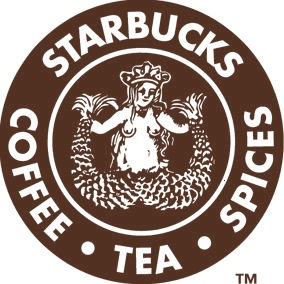
This was the original Starbucks logo circa 1971 (Starbucks is older than my mom. You go girlboss). The logo is, and has always been, a siren, a creature from Greek Mythology known for luring sailors to their demise. But this twin-tailed siren was luring people in for coffee! This naval theme goes beyond the logo, as Starbucks is named after a character in the novel Moby Dick, specifically the first mate, Starbuck. While these references to mythology and literature faded from our recognition, the Starbucks logo and name did not.
For the first 15 years of its existence, Starbucks sported this poopie-colored breast-displayin’ logo.
Now, our society quiet happily sexualizes women’s breasts. Topless women are not allowed in public, while men can hop skip and a jump with their shirt off. There’s a double standard, I won’t go too much into it. But my POINT is, this logo probably had an expiration date if they wanted people of all ages and cultures sportin’ a Starbucks sleeve. A redesign was inevitable.
The makeover came in 1987, when the company was bought by Howard Schultz. Schultz hired an artist who revealed… drumroll…
Now this looks more familiar, yes? Artist Terry Heckler dropped the brown for green, covered the sirens breasts, touched up the tails, and all in all morphed the logo into one fit for capitalistic dispersion.
Five years later, the logo was altered again. The logo was zoomed in, cutting off the siren’s naval and further resembling the current logo. On the dawn of Starbucks 40th anniversary, in 2008, a failed rebranding saw a black logo quickly scrapped due to backlash, leaving Starbucks tied to the “Starbucks green.”
In 2011, the words on the outside of the logo were dropped entirely, essentially Starbucks way of saying “yeah. you know who tf we are.” And that, ladies and gentleman, is the shortened journey of the Sbux logo, brought to you by a 19 year old hopped up on Mucinex.
Starbucks is an interesting phenomenon: a consequential intersection of capitalism, history, globalization, and economics. It features all the fun stuff from our world like cultural diffusion and entrepreneurism while also displaying predatory business practices and labor violations. It’s a case study of what happens when Western business practices capitalize off a drink beloved by cultures around the world for thousands of years. Is Starbucks the downfall of coffee? No. Absolutely not. But it has reinvented it. The history of coffee may very well be demarcated: pre and post siren.
It’s past my bedtime. See you later!


